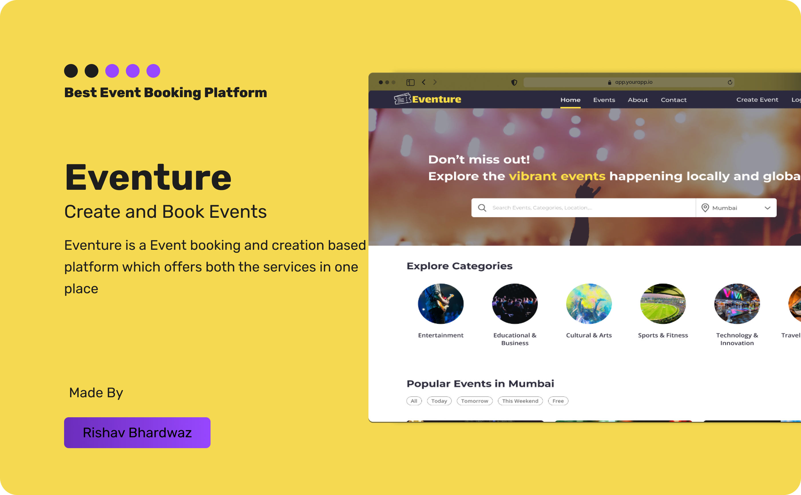
Learn making amazing website design and components with Eventrue
The Eventure Design Story: A Figma Tale of Components, Auto Layout, and a Sprinkle of Humor
Segment 1: The Birth of Components - Because Who Wants to Copy-Paste Forever?
Alright, let’s get real. If you’ve ever found yourself copy-pasting the same button 50 times in Figma, you’re doing it wrong (seriously, your mouse deserves better). Enter Components, the superheroes of the design world. In our Eventure project, we embraced components like long-lost friends, creating reusable elements to save us from design doom.
-
Step 1: Creating Components
Think of components as those perfectly crafted pizza slices that you can clone forever. Select your design (button, card, or even the all-mighty navbar), hitCtrl + Alt + K(orCmd + Option + Kon Mac), and BOOM, you’ve got yourself a reusable component. -
Step 2: Using Components
Drag and drop components wherever you need them, tweak their properties, and watch in awe as they stay consistent across the board. No more playing hide-and-seek with inconsistencies! -
Funny Hint: Components are like that one friend who remembers all your birthdays; they just never let you down.
Segment 2: Auto Layout - Because Manual Alignment is so 2010
If you’ve ever spent hours nudging elements pixel by pixel, let’s have a moment of silence. Now, let me introduce you to the game-changer: Auto Layout, the feature that makes everything snap into place like magic.
-
Step 1: Applying Auto Layout
Select a group of elements, hitShift + A, and watch them fall in line like soldiers. Adjust spacing, padding, and direction with a few clicks. -
Step 2: Adjusting Responsiveness
Whether you’re designing for a phone, tablet, or an alien spaceship, Auto Layout makes resizing a breeze. Set elements toHug,Fill, orFixedand stop worrying about manual adjustments. -
Funny Hint: Auto Layout is like having an OCD designer friend who arranges your room without you asking.
Segment 3: Design Systems - The Secret Sauce to Consistency
Ever opened an old Figma file and thought, “What in the world was I thinking?” Well, that’s why design systems exist. Eventure thrives on a well-structured design system that keeps fonts, colors, and spacing in check.
-
Step 1: Defining Styles
Head over to the right panel, click+next to text, color, or effects, and name it something reasonable (“Cool Blue” is fine, “Mom’s Favorite Shade” – not so much). -
Step 2: Staying Consistent
Use defined styles across the project to ensure that everything looks like it belongs in the same universe. -
Funny Hint: A good design system is like your mom’s favorite recipe—stick to it, and you’ll never mess up.
With these concepts in mind, the Eventure design journey has been smoother than expected (minus a few creative breakdowns and excessive coffee consumption). Figma’s features like components, auto layout, and design systems are here to save us all from chaos.
And remember: Design smart, not hard! 🎨✨
Also here is the link to the figma file of Eventrue Click Here